10,000 search results
(0.014 seconds)
- Ten - Unknown license

- Ten Ton Truck by PizzaDude.dk,
$20.00Ten Ton Truck is a heavy, but very legible font. Works very well with massive text, as well as headlines and such. - Times Ten by Linotype,
$40.99In 1931, The Times of London commissioned a new text type design from Stanley Morison and the Monotype Corporation, after Morison had written an article criticizing The Times for being badly printed and typographically behind the times. The new design was supervised by Stanley Morison and drawn by Victor Lardent, an artist from the advertising department of The Times. Morison used an older typeface, Plantin, as the basis for his design, but made revisions for legibility and economy of space (always important concerns for newspapers). As the old type used by the newspaper had been called Times Old Roman," Morison's revision became "Times New Roman." The Times of London debuted the new typeface in October 1932, and after one year the design was released for commercial sale. The Linotype version, called simply "Times," was optimized for line-casting technology, though the differences in the basic design are subtle. The typeface was very successful for the Times of London, which used a higher grade of newsprint than most newspapers. The better, whiter paper enhanced the new typeface's high degree of contrast and sharp serifs, and created a sparkling, modern look. In 1972, Walter Tracy designed Times Europa for The Times of London. This was a sturdier version, and it was needed to hold up to the newest demands of newspaper printing: faster presses and cheaper paper. In the United States, the Times font family has enjoyed popularity as a magazine and book type since the 1940s. Times continues to be very popular around the world because of its versatility and readability. And because it is a standard font on most computers and digital printers, it has become universally familiar as the office workhorse. Times™, Times™ Europa, and Times New Roman™ are sure bets for proposals, annual reports, office correspondence, magazines, and newspapers. Linotype offers many versions of this font: Times™ is the universal version of Times, used formerly as the matrices for the Linotype hot metal line-casting machines. The basic four weights of roman, italic, bold and bold italic are standard fonts on most printers. There are also small caps, Old style Figures, phonetic characters, and Central European characters. Times™ Ten is the version specially designed for smaller text (12 point and below); its characters are wider and the hairlines are a little stronger. Times Ten has many weights for Latin typography, as well as several weights for Central European, Cyrillic, and Greek typesetting. Times™ Eighteen is the headline version, ideal for point sizes of 18 and larger. The characters are subtly condensed and the hairlines are finer. Times™ Europa is the Walter Tracy re-design of 1972, its sturdier characters and open counterspaces maintain readability in rougher printing conditions. Times New Roman™ is the historic font version first drawn by Victor Lardent and Stanley Morison for the Monotype hot metal caster." - Ten Mincho by Adobe,
$69.00Ten Mincho is a Japanese typeface design from Adobe Originals, designed by Ryoko Nishizuka and useful for a broad range of settings, such as advertising copy, book titles, and headings. As a traditional Mincho-style design the strokes are slightly heavy and rounded, and exhibit smaller counter spaces. Ten Mincho also features a full set of Latin glyphs, collectively known as Ten Oldstyle and designed by Robert Slimbach. This relatively feature-rich Latin subset includes OpenType features such as small caps and old-style figures. Finally, look for a small number of color emoji in an SVG table, some of which are accessible as alternates. - Ten Till by Atavistic,
$10.00
- Ten Pounds by Up Up Creative,
$29.00 Introducing Ten Pounds, a fun, hand-drawn serif font with tons of character (and tons of characters!). Ten Pounds is perfect for branding, poster design, t-shirts, invitations, design for children, and editorial design. It comes with more than 1300 glyphs, including more than 100 ligatures. OpenType features include stylistic sets, character variants, initial and final forms, and multilingual support (including multiple currency symbols). The OpenType features can be very easily accessed by using OpenType-savvy programs such as Adobe Illustrator and Adobe InDesign. (To access these awesome features in Microsoft Word, you'll need to get comfortable with the advanced tab of Word's font menu.)
 - Ten Oldstyle by Adobe,
$35.00Ten Oldstyle is a four-weight type family from Principal Designer Robert Slimbach at Adobe. He designed it as the Latin component of Ten Mincho, a Japanese typeface by Adobe?s Chief Designer Ryoko Nishizuka. As it began to take the form of a small type family, Robert decided to release Ten Oldstyle on its own as well. - Prop Ten by Galapagos,
$39.00Some years ago we developed a monospaced 12 pitch sans serif for a client. We also created a 10 pitch version that was later discarded. PropTen is the 10 pitch version modified to proportional widths. The name PropTen refers to 'Proportional 10 Pitch'- which is a technical impossibility. It does have a slight 'its time to vote' twist to it. You know, after you pick your candidate you also need to vote yes or no on the following Propositions, don't forget Prop10, the team needs those uniforms. - Nineteen Ten Vienna - Unknown license

- Ten Million Fireflies - Personal use only

- LD Hang Ten by Illustration Ink,
$3.00 - Times Ten Paneuropean by Linotype,
$92.99In 1931, The Times of London commissioned a new text type design from Stanley Morison and the Monotype Corporation, after Morison had written an article criticizing The Times for being badly printed and typographically behind the times. The new design was supervised by Stanley Morison and drawn by Victor Lardent, an artist from the advertising department of The Times. Morison used an older typeface, Plantin, as the basis for his design, but made revisions for legibility and economy of space (always important concerns for newspapers). As the old type used by the newspaper had been called Times Old Roman," Morison's revision became "Times New Roman." The Times of London debuted the new typeface in October 1932, and after one year the design was released for commercial sale. The Linotype version, called simply "Times," was optimized for line-casting technology, though the differences in the basic design are subtle. The typeface was very successful for the Times of London, which used a higher grade of newsprint than most newspapers. The better, whiter paper enhanced the new typeface's high degree of contrast and sharp serifs, and created a sparkling, modern look. In 1972, Walter Tracy designed Times Europa for The Times of London. This was a sturdier version, and it was needed to hold up to the newest demands of newspaper printing: faster presses and cheaper paper. In the United States, the Times font family has enjoyed popularity as a magazine and book type since the 1940s. Times continues to be very popular around the world because of its versatility and readability. And because it is a standard font on most computers and digital printers, it has become universally familiar as the office workhorse. Times™, Times™ Europa, and Times New Roman™ are sure bets for proposals, annual reports, office correspondence, magazines, and newspapers. Linotype offers many versions of this font: Times™ is the universal version of Times, used formerly as the matrices for the Linotype hot metal line-casting machines. The basic four weights of roman, italic, bold and bold italic are standard fonts on most printers. There are also small caps, Old style Figures, phonetic characters, and Central European characters. Times™ Ten is the version specially designed for smaller text (12 point and below); its characters are wider and the hairlines are a little stronger. Times Ten has many weights for Latin typography, as well as several weights for Central European, Cyrillic, and Greek typesetting. Times™ Eighteen is the headline version, ideal for point sizes of 18 and larger. The characters are subtly condensed and the hairlines are finer. Times™ Europa is the Walter Tracy re-design of 1972, its sturdier characters and open counterspaces maintain readability in rougher printing conditions. Times New Roman™ is the historic font version first drawn by Victor Lardent and Stanley Morison for the Monotype hot metal caster." - Display Digits Ten by Gerald Gallo,
$20.00 Display Digits Ten is a display number font with eight sets of variations of the same digits. The digits 0 through 9, with period and comma in appropriate variations, are prepared as (1) solid, (2) outline, (3) solid with contour outline, (4) outline with 3-D shadow, (5) 3-D shadow only, (6) outline with drop shadow, (7) positive in circle, (8) negative in circle.
 - One Ton by Luke Thompson,
$10.00 One Ton is a really chunky stencil face that sticks to some strict rules, giving it a distinctively industrial, angular look. It's designed so that the spaces between characters all align in a strong grid. It can bring a ton of personality to signage, branding, editorial and packaging projects where you can afford to be a bit experimental.
 - Tek Stencil by Fonthead Design,
$12.00 - Ton by Katatrad,
$22.00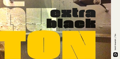
- Nineteen Ten Vienna - Extra - Unknown license

- KG Ten Thousand Reasons by Kimberly Geswein,
$5.00 Chalkboard or crayon-style handwriting with great legibility.
 - Visitor BRK Ten Pro by CheapProFonts,
$10.00 This is the first true pixel-font released by CheapProFonts. It may not be the first font based on a 5x5 pixel grid, but it probably has the best language support. The glyphs have all been optimized for Flash (by making the pixel shapes slightly overlapping) and should render sharp and perfect when set in 10px size (or multitudes of 10). As with all pixelfonts: make sure to place the text at coordinates with whole numbers, and always use left (and NEVER centered) alignment. ALL fonts from CheapProFonts have very extensive language support: They contain some unusual diacritic letters (some of which are contained in the Latin Extended-B Unicode block) supporting: Cornish, Filipino (Tagalog), Guarani, Luxembourgian, Malagasy, Romanian, Ulithian and Welsh. They also contain all glyphs in the Latin Extended-A Unicode block (which among others cover the Central European and Baltic areas) supporting: Afrikaans, Belarusian (Lacinka), Bosnian, Catalan, Chichewa, Croatian, Czech, Dutch, Esperanto, Greenlandic, Hungarian, Kashubian, Kurdish (Kurmanji), Latvian, Lithuanian, Maltese, Maori, Polish, Saami (Inari), Saami (North), Serbian (latin), Slovak(ian), Slovene, Sorbian (Lower), Sorbian (Upper), Turkish and Turkmen. And they of course contain all the usual "western" glyphs supporting: Albanian, Basque, Breton, Chamorro, Danish, Estonian, Faroese, Finnish, French, Frisian, Galican, German, Icelandic, Indonesian, Irish (Gaelic), Italian, Northern Sotho, Norwegian, Occitan, Portuguese, Rhaeto-Romance, Sami (Lule), Sami (South), Scots (Gaelic), Spanish, Swedish, Tswana, Walloon and Yapese.
 - Old Number Ten NF by Nick's Fonts,
$10.00 Here is a faithful revival of Gothic Number Ten, released by the Cincinnati Type Foundry in the late 1800s. Not your garden-variety sans-serif, its quirky caps will warm up your headlines. Both flavors of this font feature the 1252 Latin, 1250 Central European, 1254 Turkish and 1257 Baltic character sets.
 - Trek - Unknown license

- Keks by Hubert Jocham Type,
$29.90 And now something completely different. Keks has broken elements like a blackletter typeface, but the actual forms are roman. That keeps it very legible although there is no curve at all. What was the inspiration for designing the font? Blackletter has an interesting history here in Germany. We need to find contemporary interpretations for this tradition. What are its main characteristics and features? Legible roman blackletter Usage recommendations: any usage that needs a black letter athmosphere where legibility is important.
 - Toons One - Unknown license

- Zwoelf Ton by Volcano Type,
$19.00 - Xray Ted - Unknown license

- Trek Trooper - Personal use only

- Tea Dance by Studio K,
$45.00 If you think nostalgia isn't what it used to be, this will change your mind. A ritzy new font family from Studio K that will transport you back to the era of afternoon tea dances performed to the strains of the Palm Court Orchestra or the Bath Pump Room Quartet: a celebration of the golden age of dance from Busby Berkeley to Fred Astaire and Ginger Rogers. Enjoy!
 - Jasmine Tea by Goodigital13,
$20.00 Characters So beautiful on invitation like greeting cards, branding materials, business cards, quotes, posters, and more!!
 - Tea Biscuit by Fenotype,
$39.00 Tea Biscuit is a classy upright script family with its roots in the past. It’s inspired by hand lettering of the 1950s, but finished with a modern, smooth appearance. The Tea Biscuit Family contains four weights, each of which contains more than 1200 glyphs, to fulfill the tasks of modern design challenges while retaining a customised look. Tea Biscuit is equipped with plenty of features to achieve a custom-designed look. When the Standard Ligatures function is on, the font automatically chooses different letterforms on the fly, depending on which characters appear first. For a bit of extra flavour, turn on Swash, Stylistic or Titling Alternates in any OpenType-savvy program for even more extra swirls and swashes. The Tea Biscuit family comes with a set of matching Ornaments to support your designs. In addition, Small Caps are included within the fonts: a complete set of frisky block letters that can be used on their own or to support the Script font. Enjoy!
 - Tex Writer by Designova,
$15.00 Tex Writer is a custom handmade / handwritten Serif typeface with a simple and casual personality making it perfect for text typography, logotypes, marketing graphics, branding, package and advertisement design and anything in between. Extended Character Sets Along with the basic Latin character set, we have added Western European, Central European, South Eastern European character sets for your convenience. What You Get This typeface comes with 14 fonts having 7 weights + 7 italics (Light / Regular / Medium / SemiBold / Bold / ExtraBold / Heavy).
 - Afternoon Tea by Rocket Type,
$19.95 Afternoon Tea is inspired by a lettering specimen featured in Letters and Lettering by Paul Carlyle and Guy Oring published in 1938. The striking features are the elegant balance between thick and thin strokes (demonstrating its obvious ink pen influence) while maintaining a sturdy presence which is ideal for titles and headings. Afternoon Tea is caps only.
 - Cuppa Tea by Jonahfonts,
$35.00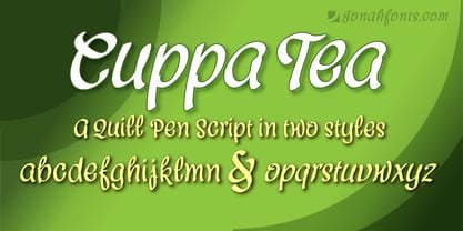
- Happy Teas by Kellina James Designs,
$20.00 Happy Teas is a handwritten script font that was designed to create a sense of joy and fun. It includes upper and lowercase letters, numerals, punctuation, and multilingual support. In addition, there are also special characters, alternates, and ligatures to add more flair to your projects. Great for invitations, headers, packaging, branding, wall art, and more.
 - Imperial Tea by Hanoded,
$15.00 I am a coffee person, but two years ago, just before the whole Covid-thing happened, I came down with what I assumed to be the flu. It was a really nasty flu as well: I was down for 10 days or so and when I sort of recovered, nothing tasted the same. Coffee tasted like cardboard and I couldn't stand the taste of it, so I decided to drink tea instead. The 'supermarket tea' we have in Holland is quite bad and tasteless, so I ordered some proper strong English tea online and I have been drinking it ever since. Of course I was thinking of this when I created Imperial Tea font. Imperial Tea font was made with... yes, you've guessed it: Chinese ink and a brush. Imperial Tea is a nice, 'oriental-ish' looking font that comes with a set of alternate glyphs and an impressive language support, including Vietnamese and Greek.
 - Tee Franklin by Suomi,
$19.00 The British Vogue commissioned this typeface for their magazine re-design in 2001. After studying the originals of Morris Fuller Benton and the existing versions, this font was designed with all new thin weights. Just when the family was finished, Vogue informed that they had decided to use American Typewriter instead. Bastards. But here is a true classic typeface with a facelift. The pun intended. Tee Franklin has seven weights with obliques, the Heavy being just slightly heavier than the existing versions from Adobe and ITC, and moving down to totally new Ultra Light, using Luc(as) de Groot's formula to keep the weights optically correct. The glyphs are the same as the Morris Fuller Benton's original from 1902, except for the upper case Q, which was re-designed with a loop in the counter for added differentiation.
 - Tel Avaloz by Ilhamtaro,
$23.00 TEL AVALOZ is a vintage font with a serif base. But even though it's vintage, it's also suitable for modern designs. Also suitable for headlines, social media design and branding. To enable the OpenType Stylistic alternates, you need a program that supports OpenType features such as Adobe Illustrator CS, Adobe Indesign & CorelDraw X6-X7. Cheers!
 - FM Ted by FontMeister,
$24.95 ‘Ted’ is a geometric typeface. It is a synthesis of the geometric and the humanistic. It has both mathematical straightforwardness, and humanistic refinement. It will shine in both headlines and text. It is well suited for graphic design and corporate identity design. It's tall shape, high middle line and form gives ‘Ted’ neo art-deco look and feel.
 - Wishbone Tea by Allouse Studio,
$16.00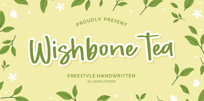 Wishbone Tea a Freestyle Handwritten Font. Wishbone Tea is perfect for any titles, logo, product packaging, branding project, megazine, social media, wedding, or just used to express words above the background. Wishbone Tea also come with Multi-Lingual Support. Enjoy the font, feel free to comment or feedback, send me PM or email. Thank You!
 - Lemon Tea by Fikryal,
$18.00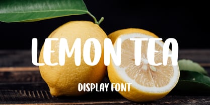 Lemon Tea is a fancy font perfect for crafting, branding, invitation, stationery, wedding designs, social media posts, advertisements, product packaging, product designs, label, photography, watermark, special events or anything. Lemon Tea with full set of uppercase letters, multilingual symbols, numerals and punctuation.
 - Tex Mex by FontMesa,
$25.00 Tex Mex is simply a spurred version of our Saloon Girl font family. When you think of a classic western font you think of spurs in the letters, with Tex Mex we set out to create a font that stands out and says Western. Whether you're making a new steakhouse menu or a new logo for your cowboy boot and hat company Tex Mex is the font you're looking for. If you're a pioneer in the culinary scene Tex Mex is perfect for you're next cookbook cover, chili cook off or barbecue competition. Just like our Saloon Girl font Tex Mex also works in layers, to make a layered font image you'll need an application that works in layers such as Illustrator or Photoshop.


Page 1 of 250Next page